Rocket
Redefined Rocket’s fintech app into a product-led growth experience with credit scores, recommendations, and long-term engagement tools.
Product DesignUIUXFront End
TL;DR
Directed the redesign of Rocket’s fintech web app, evolving it from a transactional product recommender to a product-led growth experience. This shift gave users access to credit scores, personalized recommendations, and ways to improve eligibility for future products.
Role
Title: Design Director
Team: PM, Marketing Director, Development Team
Contributions: Led rebranding, UX/UI, product design, and prototyping
Timeline: 3 months
Impact: Transitioned Rocket to a product-led growth model, boosting long-term engagement by empowering users with credit insights and pathways to achieve desired financial products.
Overview
Rocket is a fintech startup based in Mexico that provides financial tools for millenials. Financial Analysis, launched in 2017, allows users to authenticate directly with Buró de Crédito (Mexico’s Credit Agency) and obtain an easy to understand overview of their credit history, with recommended actions and content to improve their score and the best credit options for each person.
Problem
Financial Analysis, a financial tool for millennials in Mexico that allowed users to authenticate with Buró de Crédito and obtain an overview of their credit history. However, despite solving a real problem for users, retention rates were not as good as expected, indicating a need for improvement in the onboarding experience and analysis and recommendation screens.
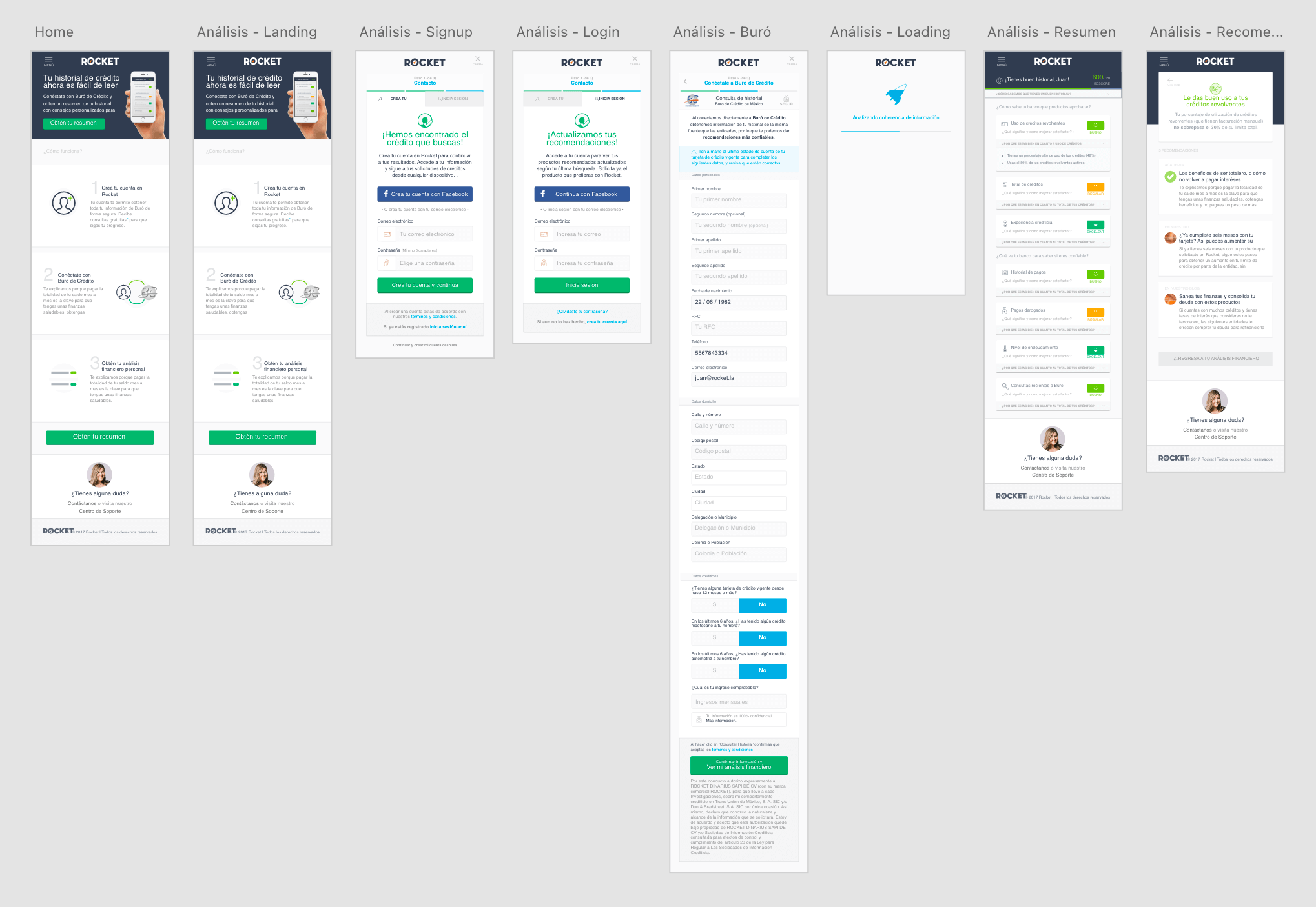 Financial Analysis v1
Solution
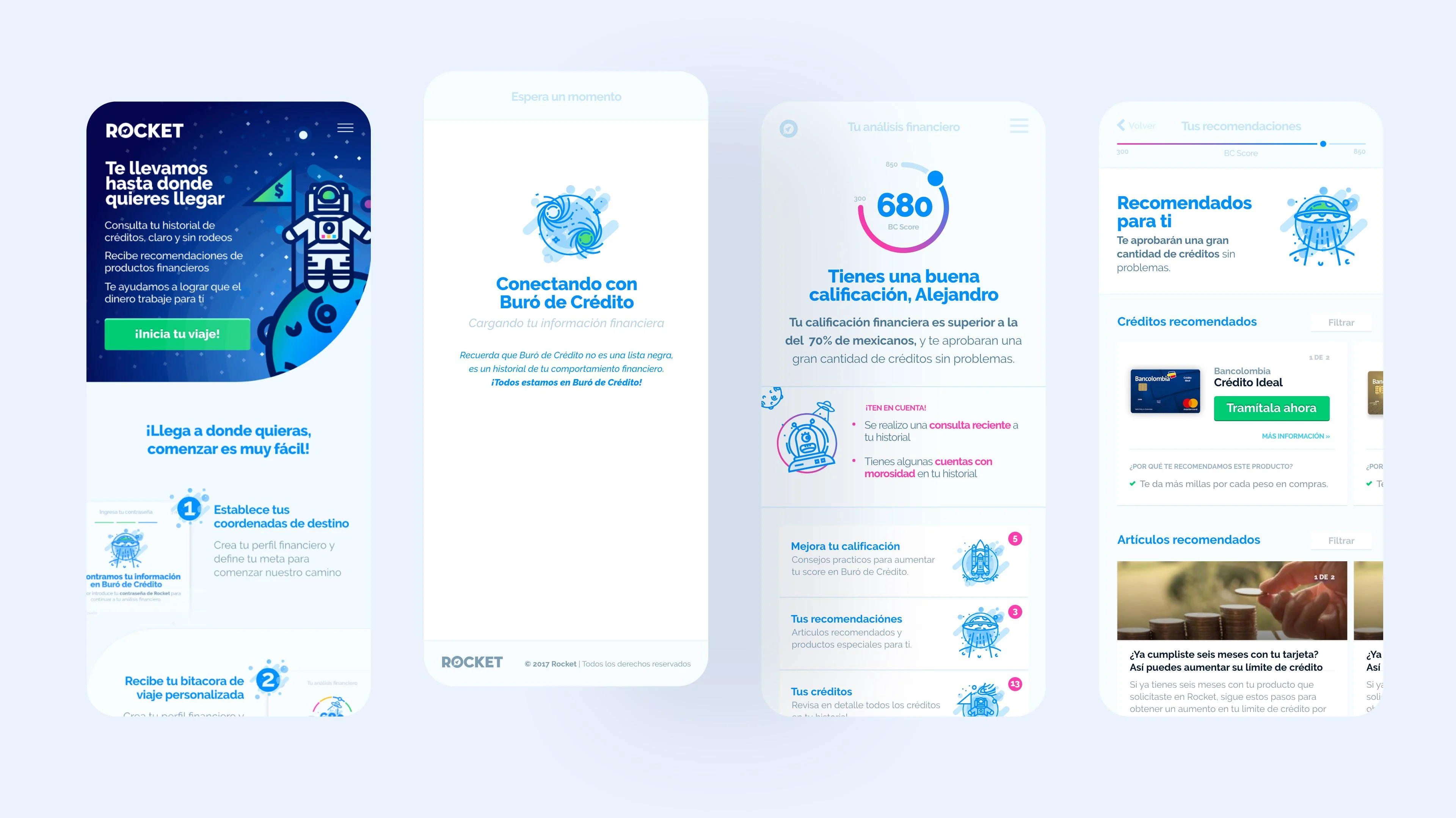
 Rocket v2
As Design Director, my role involved creating a design system that would serve as the base for the new onboarding experience and refresh the visual language to align the brand name with the value offer.
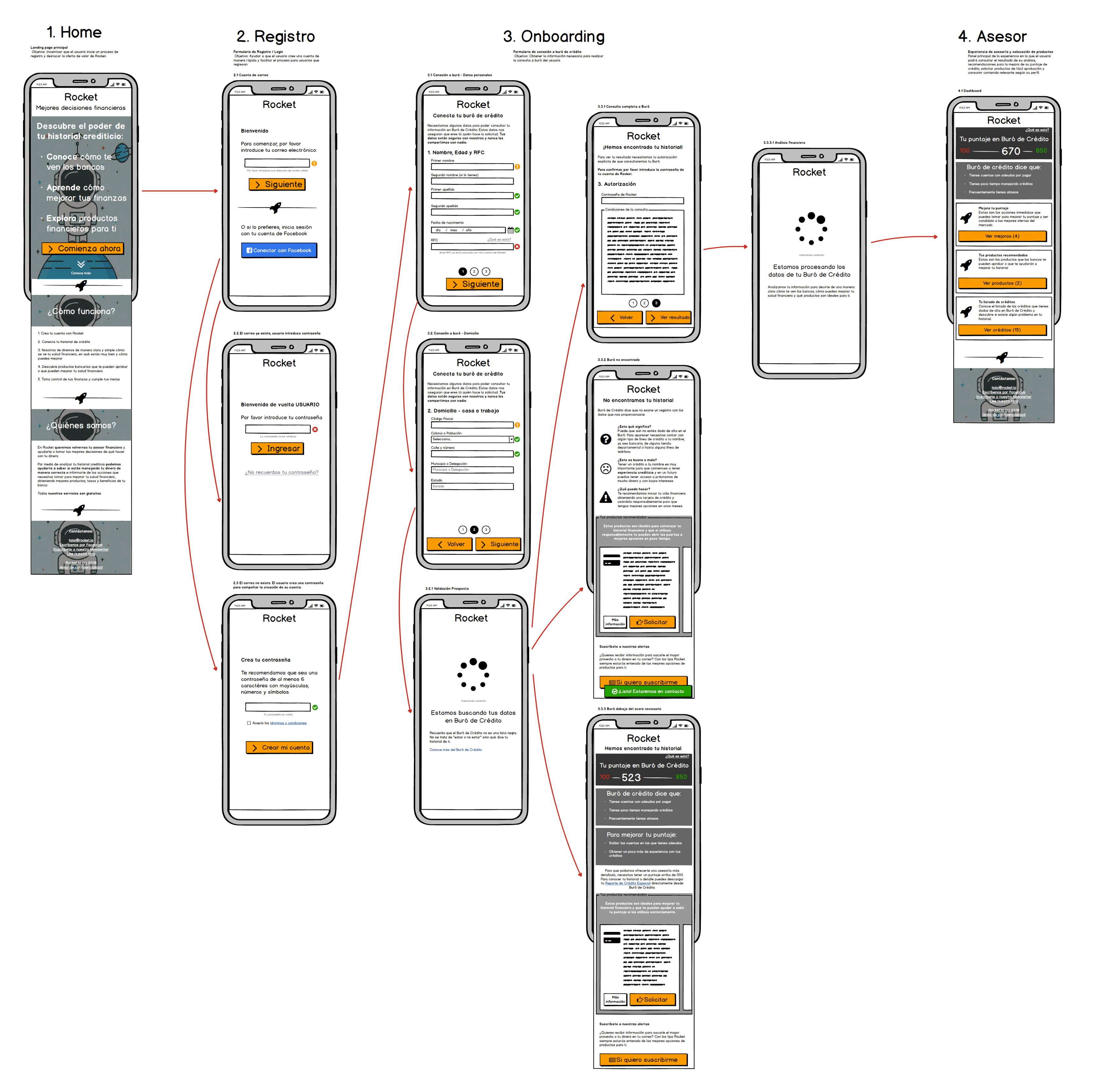 Wireframes
The redesign aimed to improve conversion rates and retention rates by providing better feedback and actionable recommendations, content, and tips to improve credit scores.
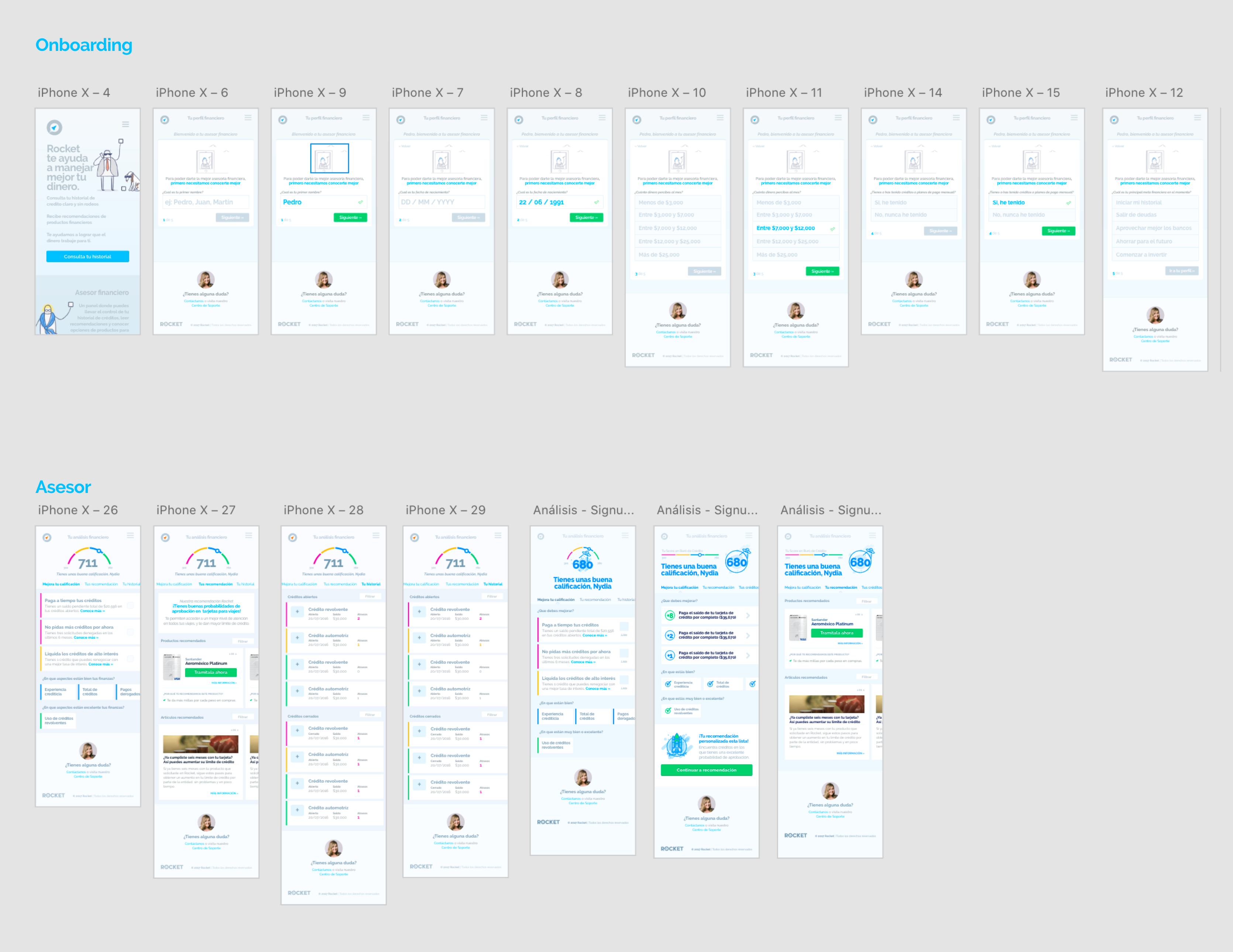 Prototype v1 (Low Fidelity)
The dashboard view was also redesigned to highlight important actions and make it easier for users to find what they are interested in or should have a look at and get there faster.
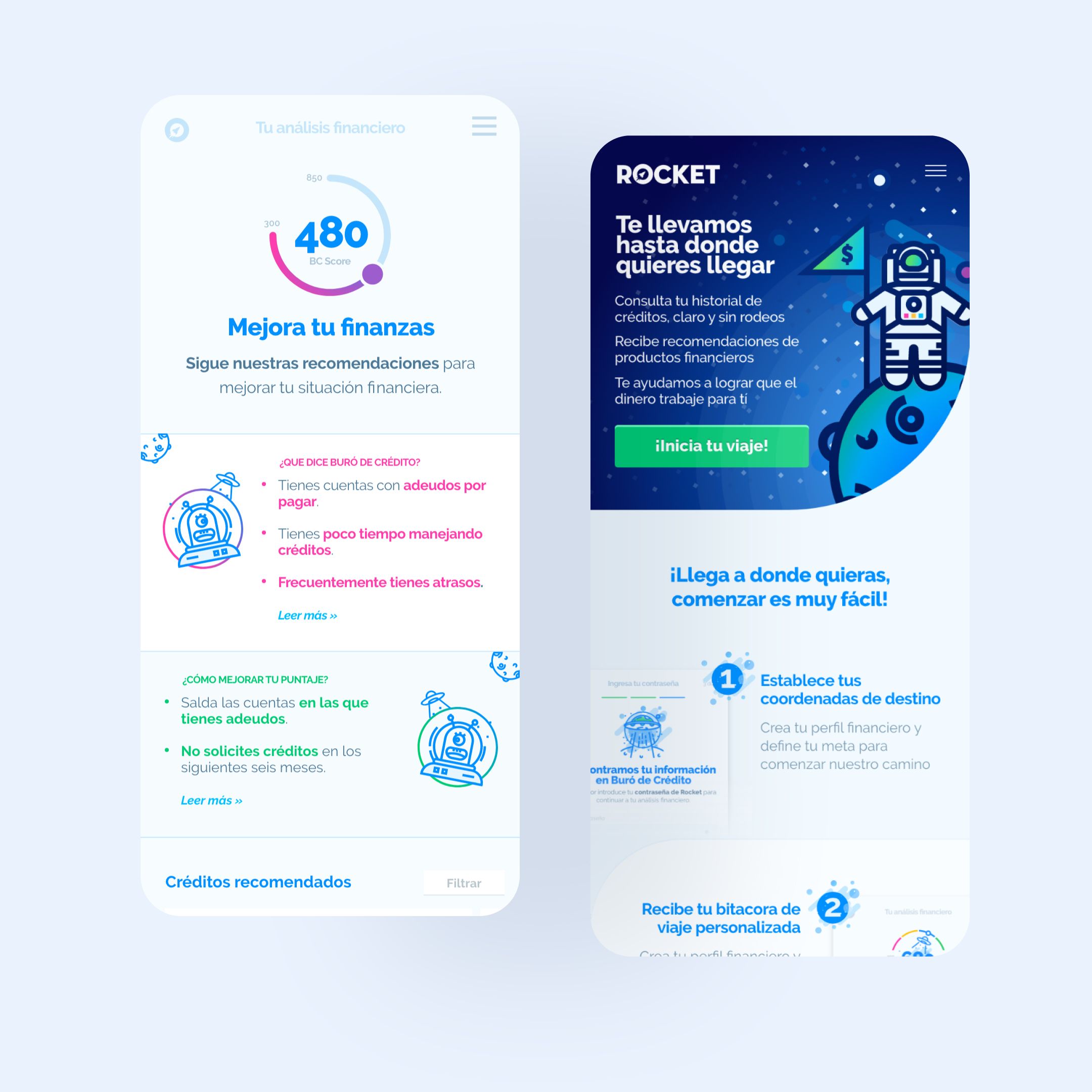 Home and Dashboard screens
Impact
- The redesign led to a 47% reduction in bounce rate (from 71% to 33%), a 63% improvement in retention rates (from 10% to 23%), and reduced times for new product iterations.
- The improved metrics helped Rocket focus on growth and reach up to 2,000,000 users.
- The redesign established clear alignment between brand and value offer, making the product message more consistent.

